Workplace Experience:
Re-imagining a New Responsive Web Experience for Financial Professionals
Overview
Workplace Experience (WX) is the primary platform providing a way for internal and external financial professionals to monitor and manage their benefit programs. It is a data-driven platform that provides tools and features such as an overview dashboard and financial reporting.
WX is a crucial tool for Transamerica large and mega market clientele ($50M-$1B and $1B+ in assets, respectively). It provides a way to gather key insights on the overall health of a plan and participants, along with tools that facilitate important transactions.
Problem
We needed to create a refreshed and responsive web experience for the new platform, which included a dashboard and a reporting center. Additionally, we needed to design the new platform with the goal of sunsetting the legacy platform, which was still an active product.
Solution
We launched a new, streamlined design for the dashboard and reporting tool. This update simplifies the user experience by prioritizing critical information with a cleaner, modern layout.
Impact
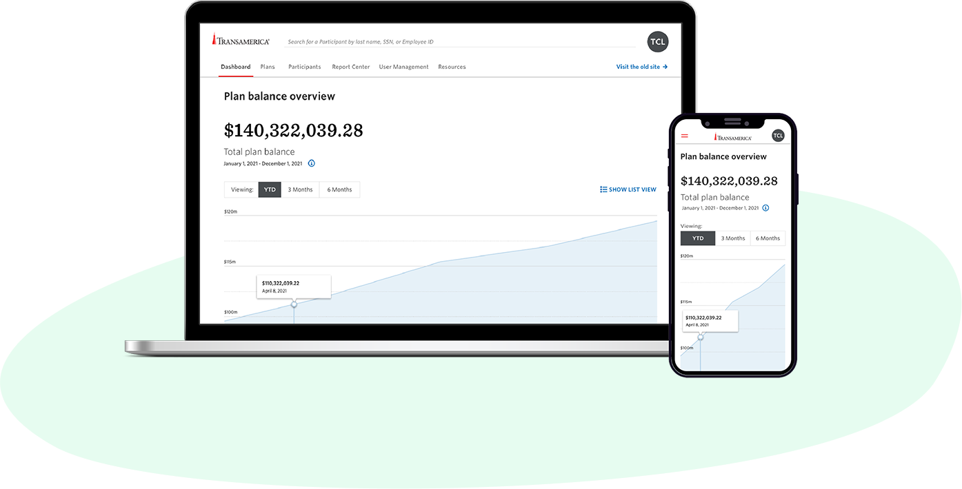
The new design was released to all users, providing a more intuitive and efficient experience. This served as the foundation for new features and functionality, and a modernized experience for financial plan management.
Role
UX/UI designer
Team
1 PM, 1 Researcher, 3 Engineers
Platforms
Responsive web
Focuses
- Redesign
- New design
The problem, in detail
Data and insights are very important to the WX user base. Managing plan health and potentially hundreds of thousands of participants requires a lot of time. My focus was to help bring more insights and data to the user and minimize the time and numbers of steps to do so. My task was to redesign the legacy dashboard and reporting tools.
Dashboards are almost always the first thing the user sees once logged in. Dashboards, therefore, are huge opportunities to influence user behaviors (such as increase engagement) and to set their expectation for the session experience. It was evident from our outdated legacy dashboard that we needed to improve the functionality and provide a refreshed, modern look and feel.
Reporting capabilities allow users to dig deeper into data and insights, which is a critical requirement for managing plans and participants. How could we create a reporting tool that was intuitive and made report creation easy? My focus was to design a new reporting tool, which we called the Report Center.
Discovery
Our initial discovery phase shed light on key requirements we needed to account for:
- There were many user types that needed to use the platform. Dashboard and the Report Center needed to be flexible and address the needs of various user types.
- Power users did not want much or any of the features to be removed from legacy. We had to make sure to meet a 1:1 feature parity.
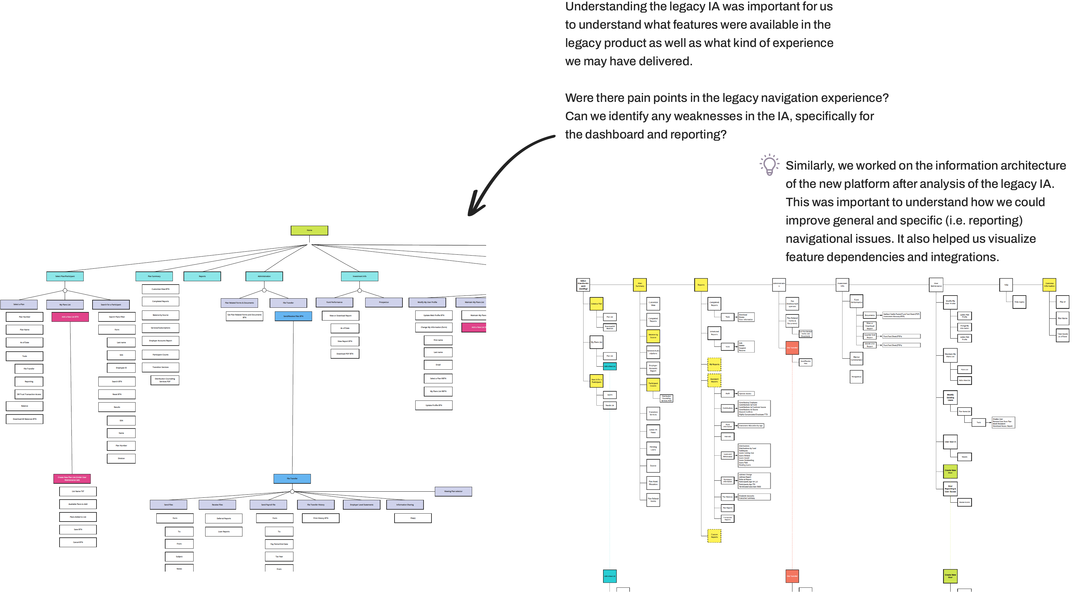
- We needed to address the weaknesses in the legacy IA around Dashboard and reporting. E.g. users were not aware of certain features due to poor findability.
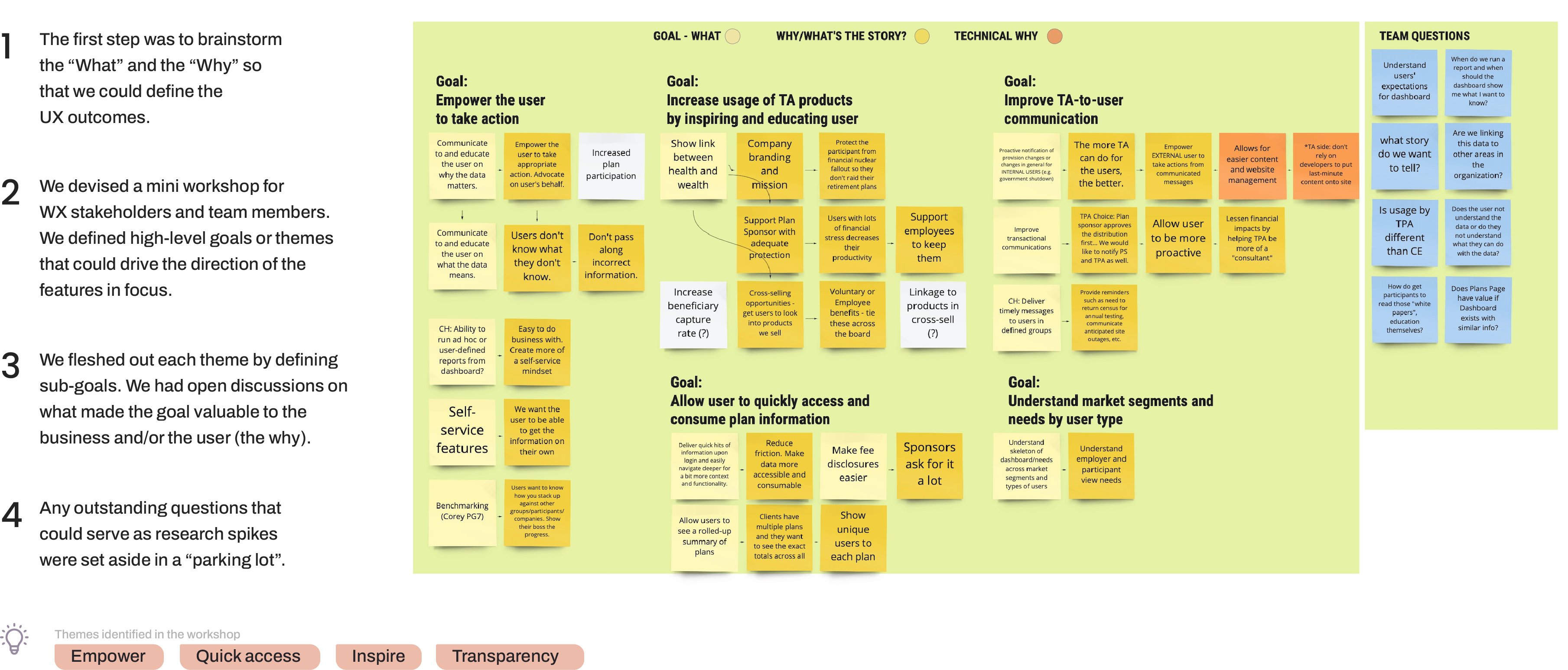
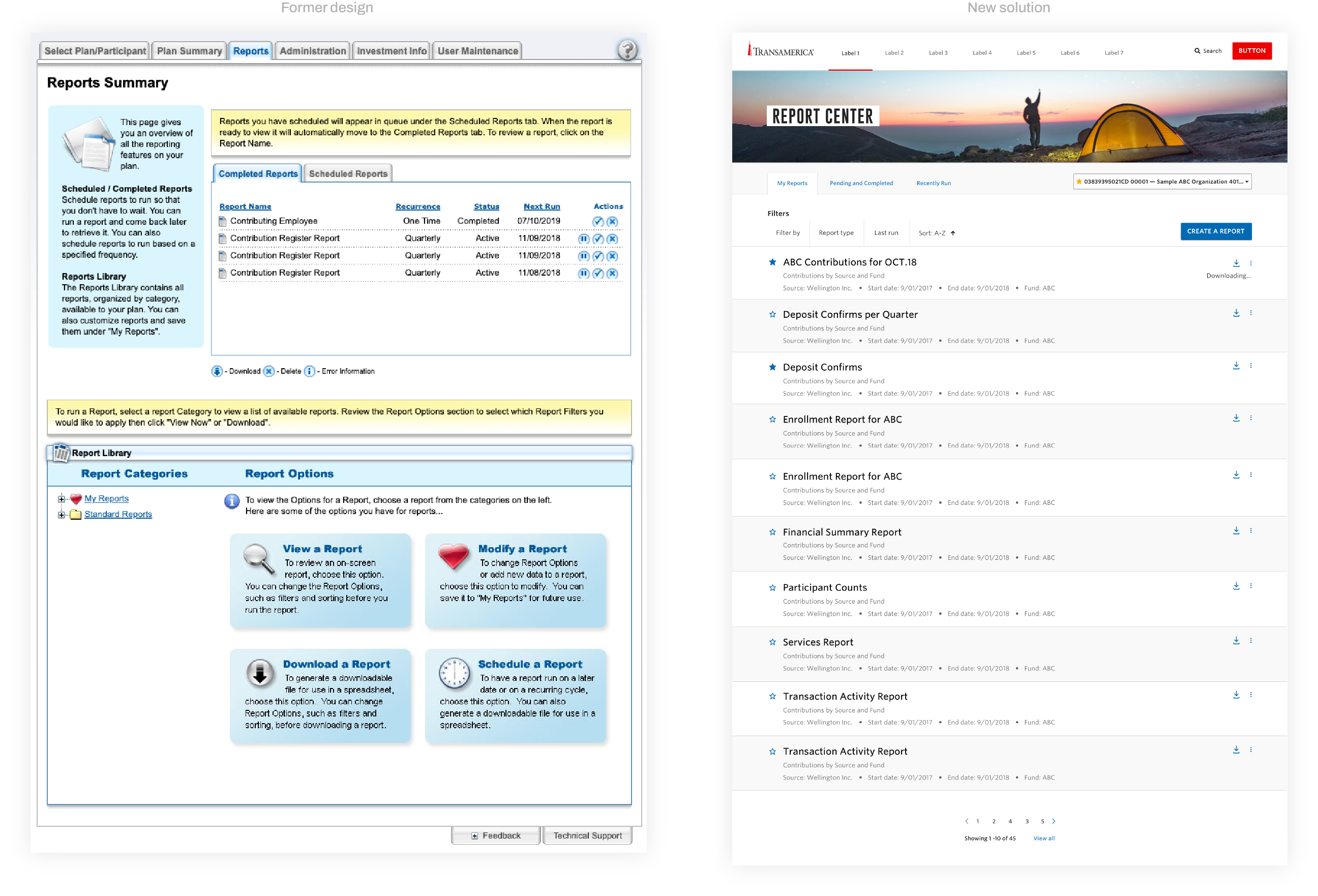
After themes were defined, we created site maps to identify legacy IA challenges around dashboard and reporting. IA analysis helped us understand the product offering, which shed light on how feature parity could be met. Afterward, we conducted a full UI review of the legacy feature sets, identified weaknesses in the experience, and reviewed all research available.
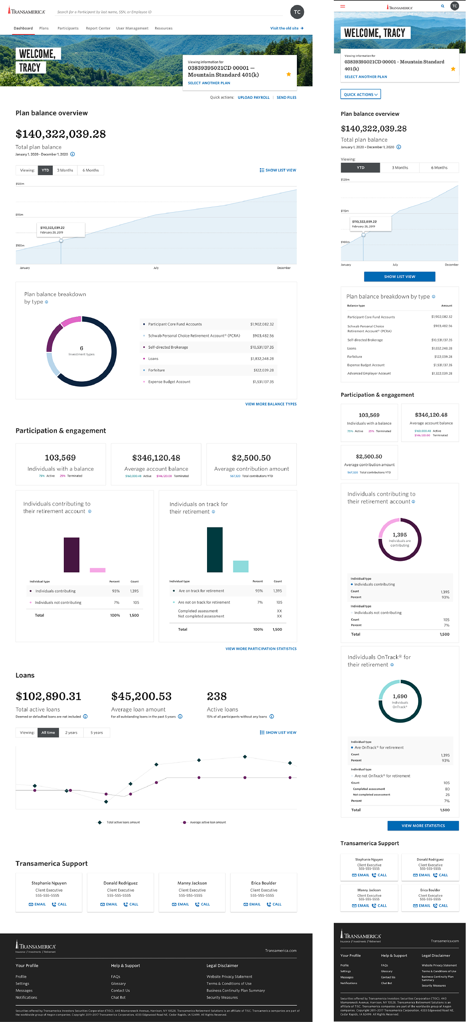
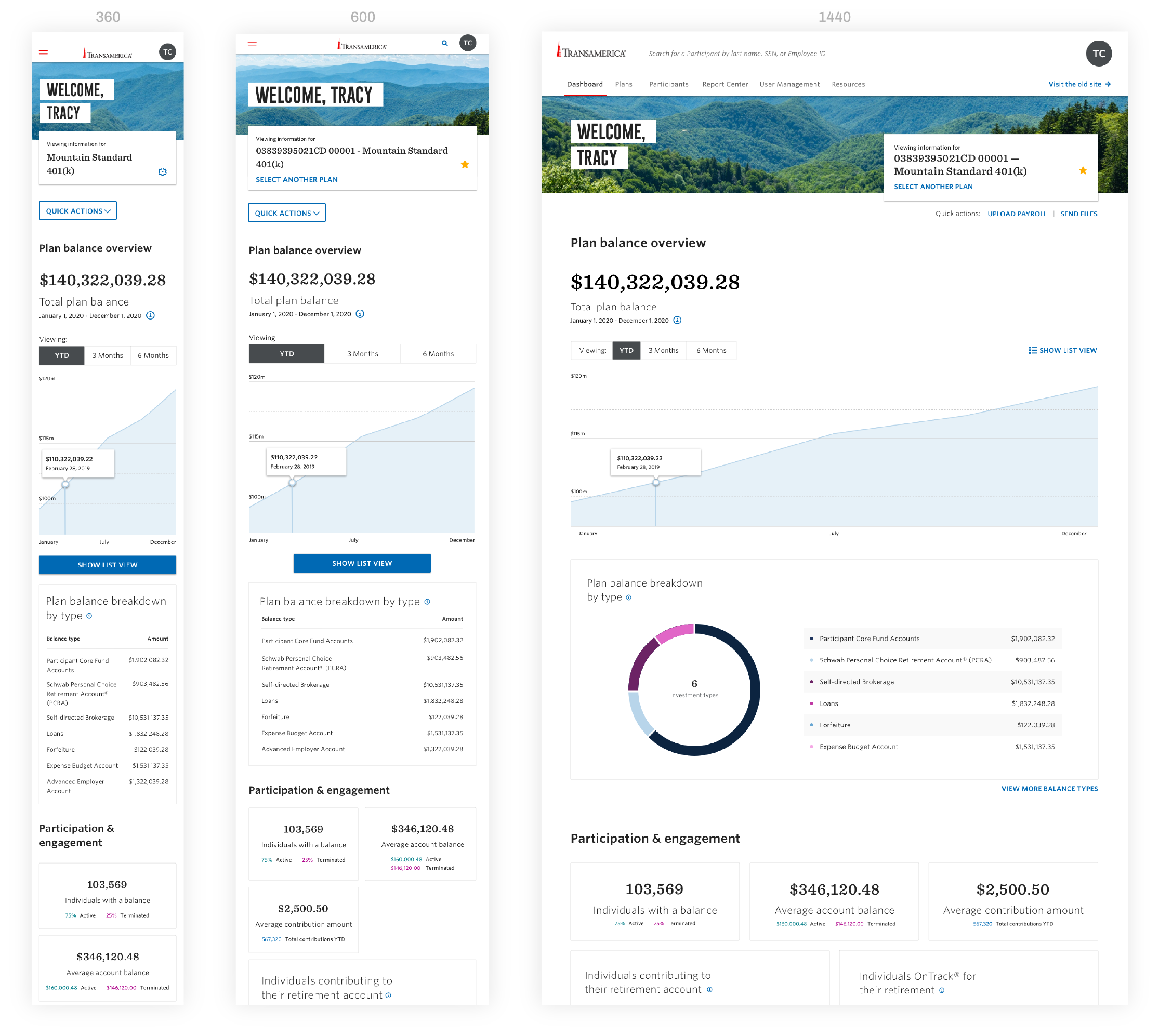
Dashboard
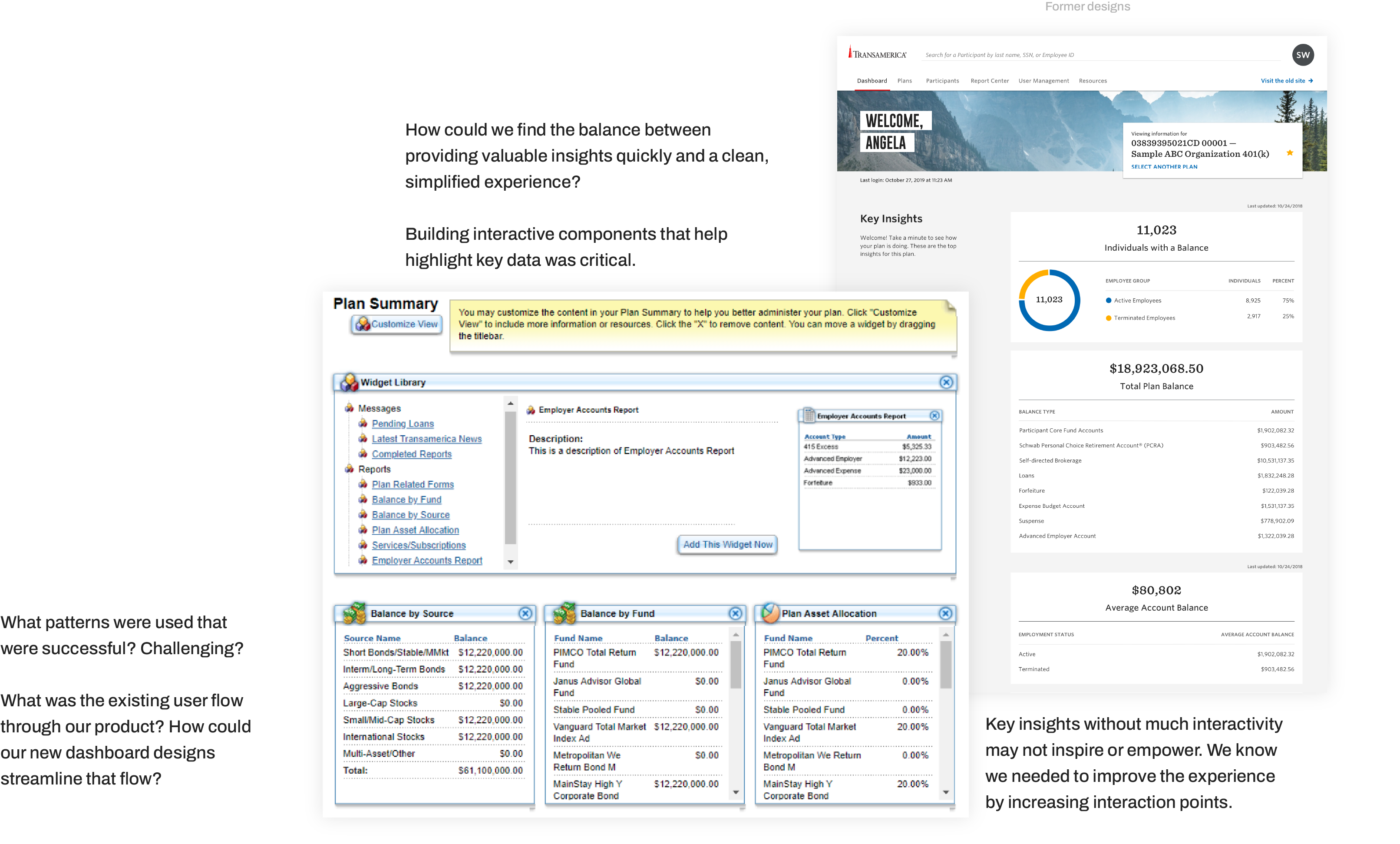
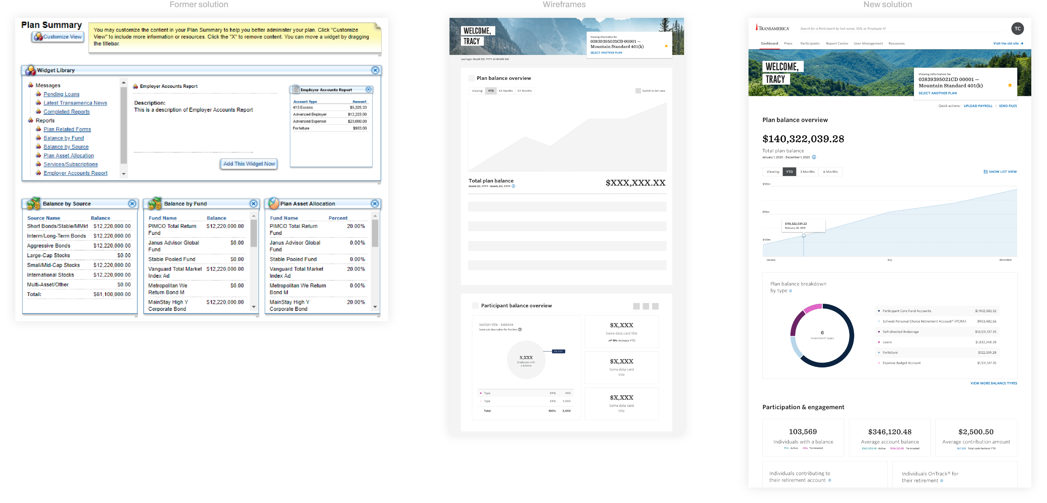
A full review of the former designs provided insight into the existing experiences and previous design decisions. We pinpointed user, internal, and SME (subjuect matter expert) feedback to what we discovered in the UI.
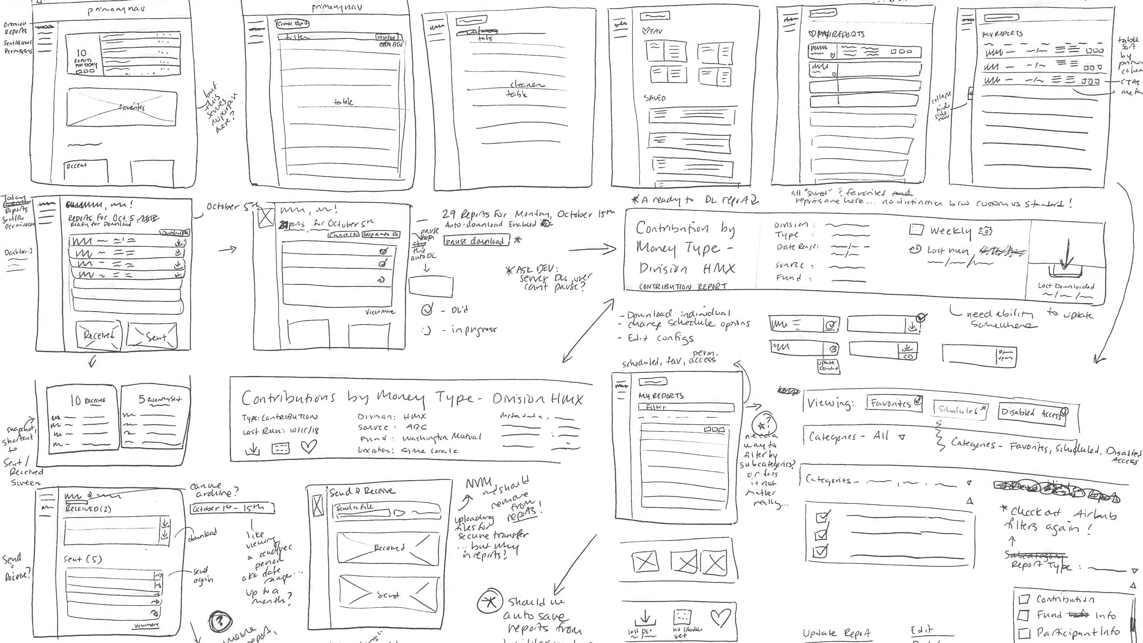
We started sketching out some ideas, placing focus on some themes that came from our initial workshops. We looked at how other financial products may have designed their dashboards, along with some of our favorite apps.
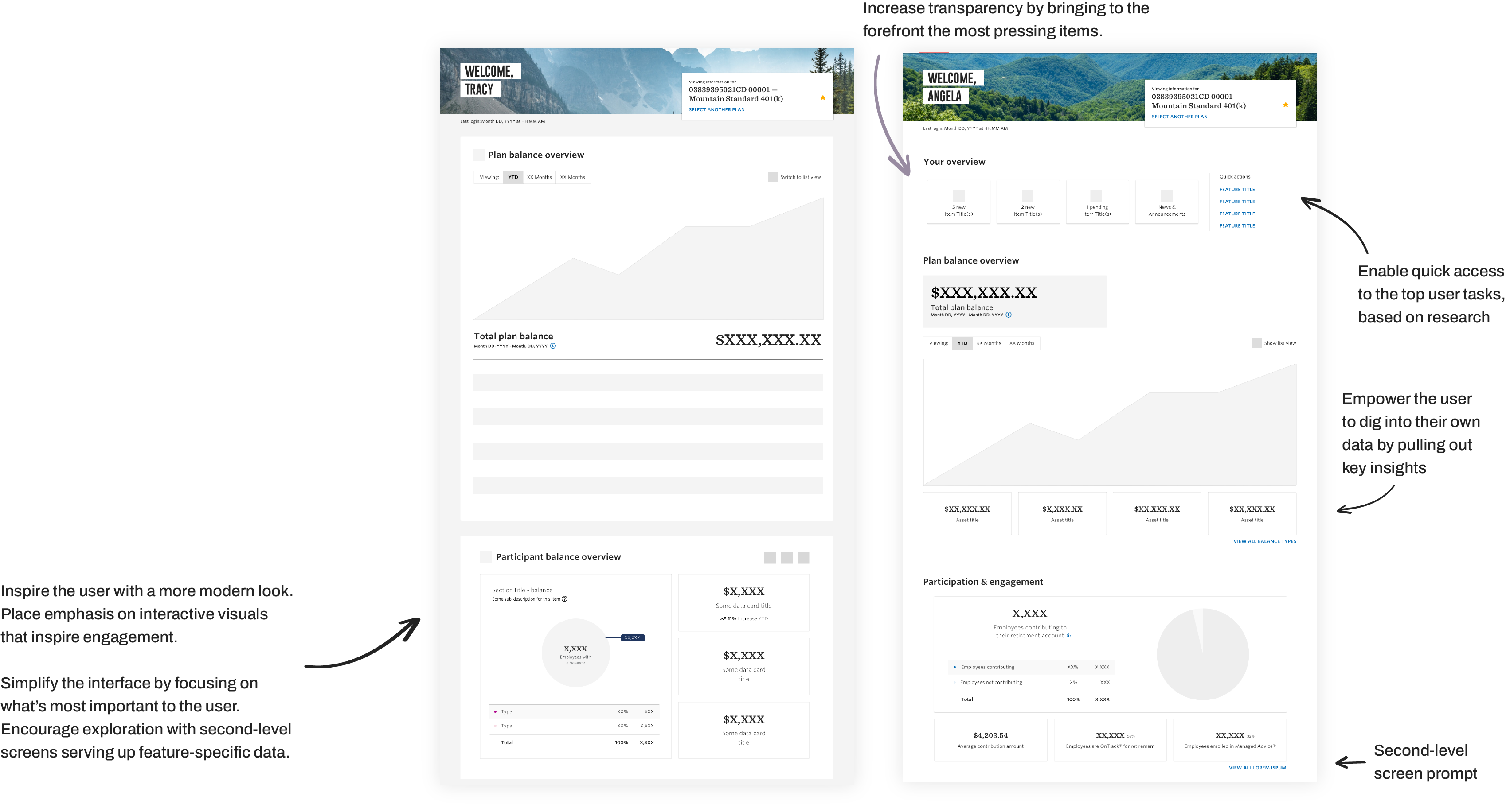
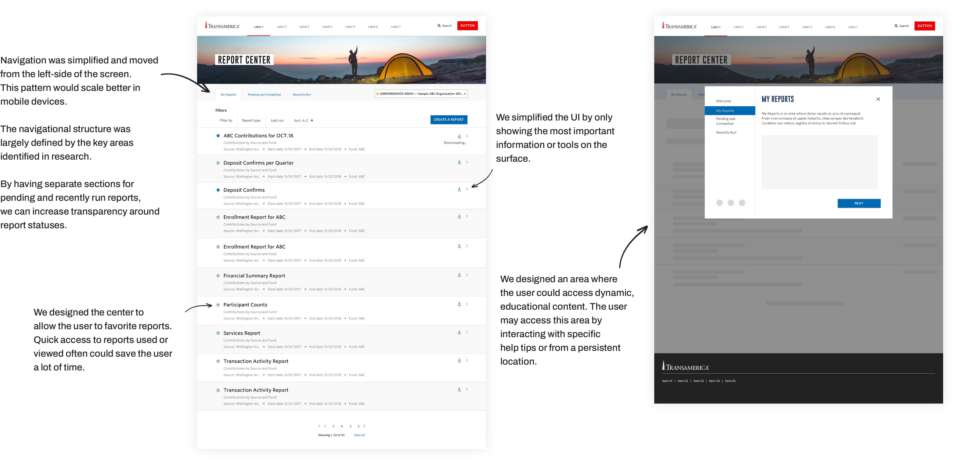
We created responsive designs that addressed the themes identified in our workshops. Ultimately, we designed widgets with the intent to reuse in our other key area, the Report Center. These widgets would allow for a quick glance of key insights. Users needed more than quick key insights to “reporting” information, they needed something more robust.
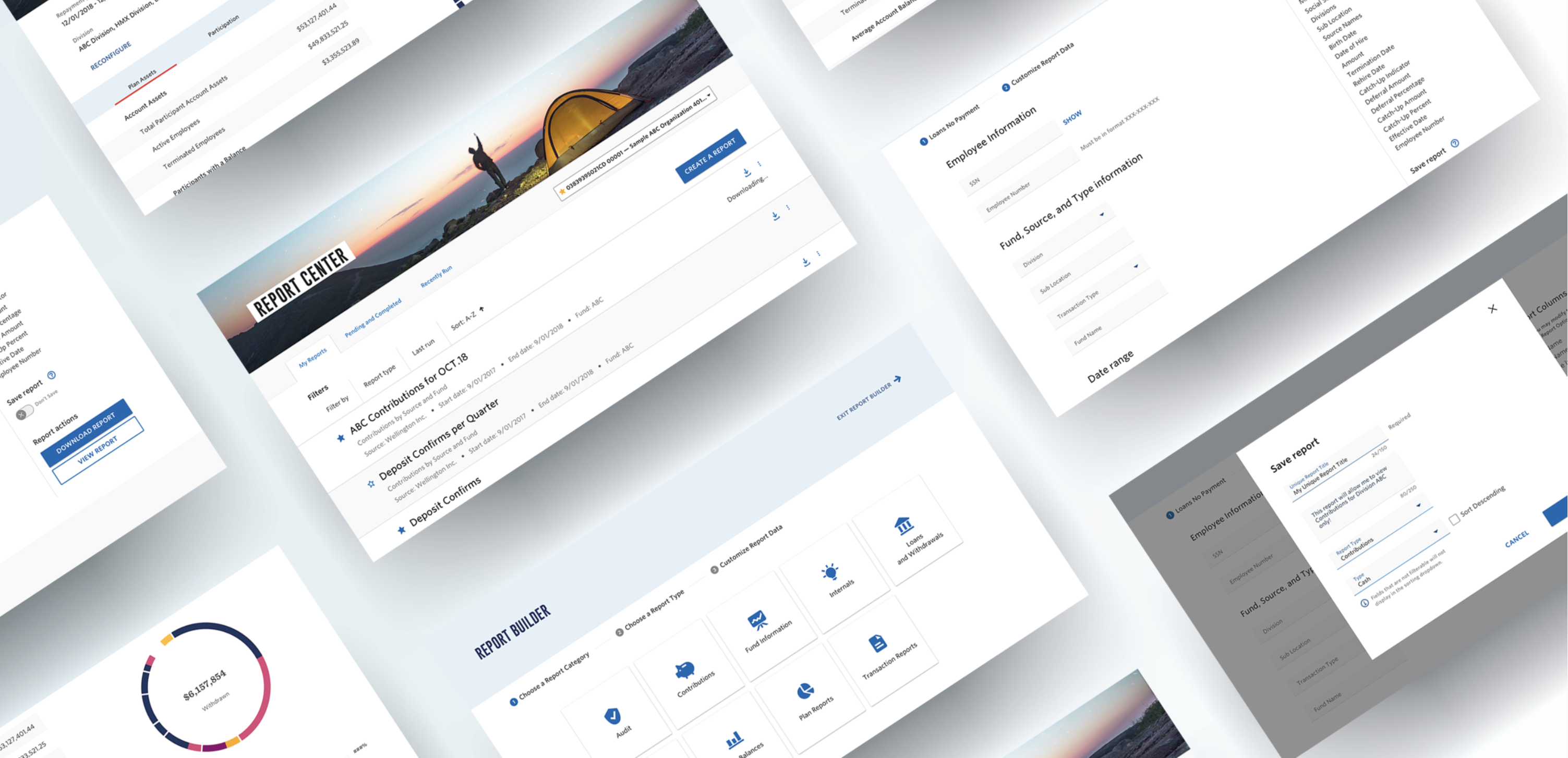
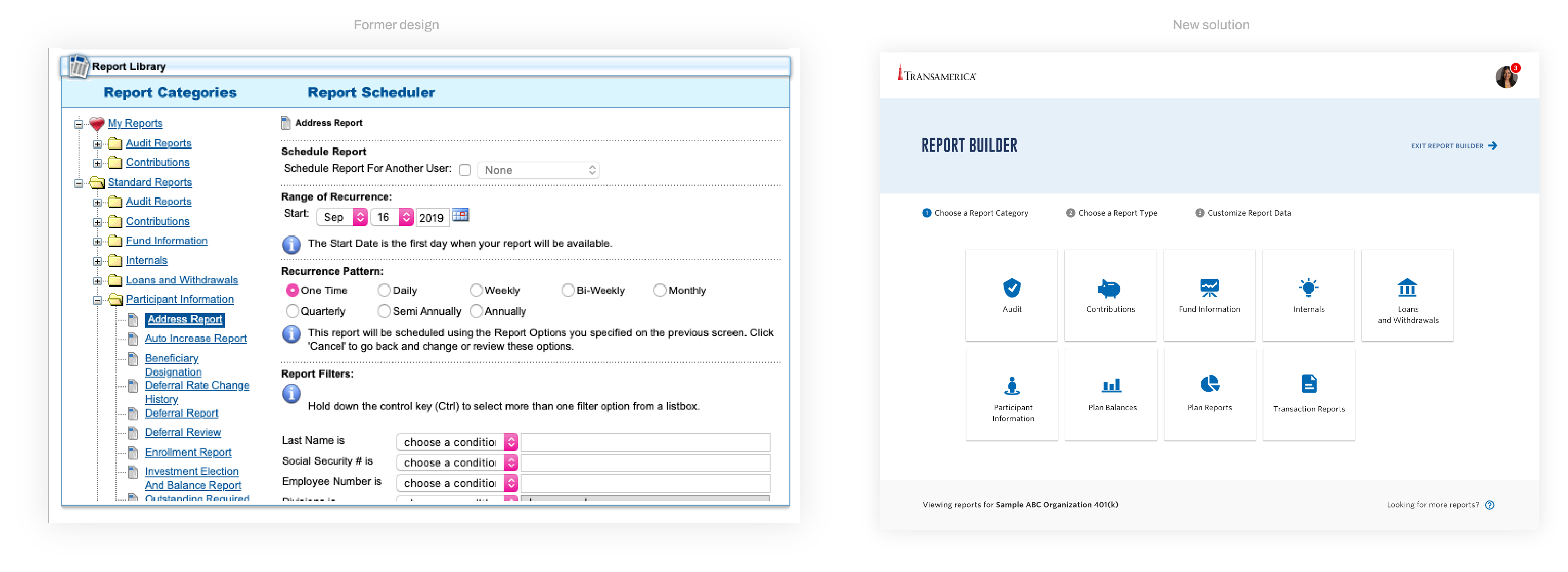
Reports
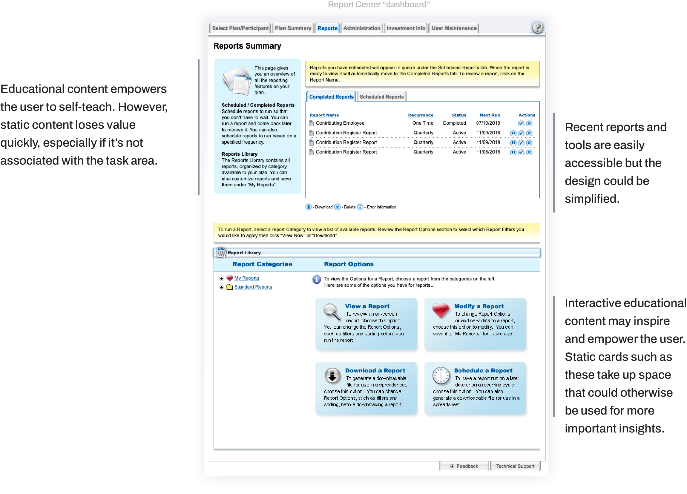
For Reports, in order to understand how to provide a robust report center experience, we conducted a full UI review of the former designs. How did users dig into data in the legacy experience? How did the legacy experience address the themes identified? Transparency, Quick access, Inspire, Empower
In our UI analysis, we discovered critical UX issues concerning: Navigation, report creation flow, and clarity and transparency.
The former experience was robust but these issues could hinder the user from using it to its full potential.
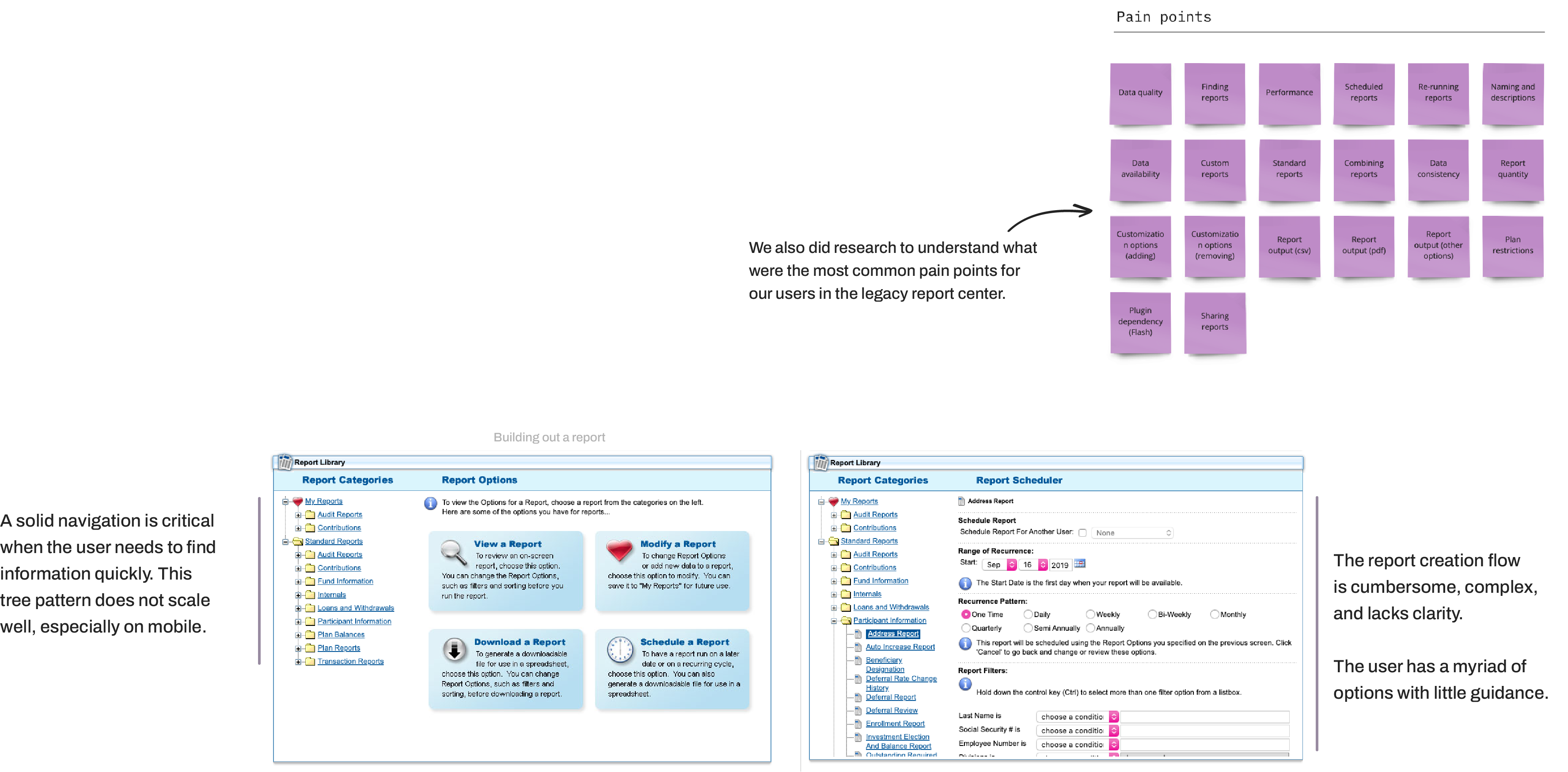
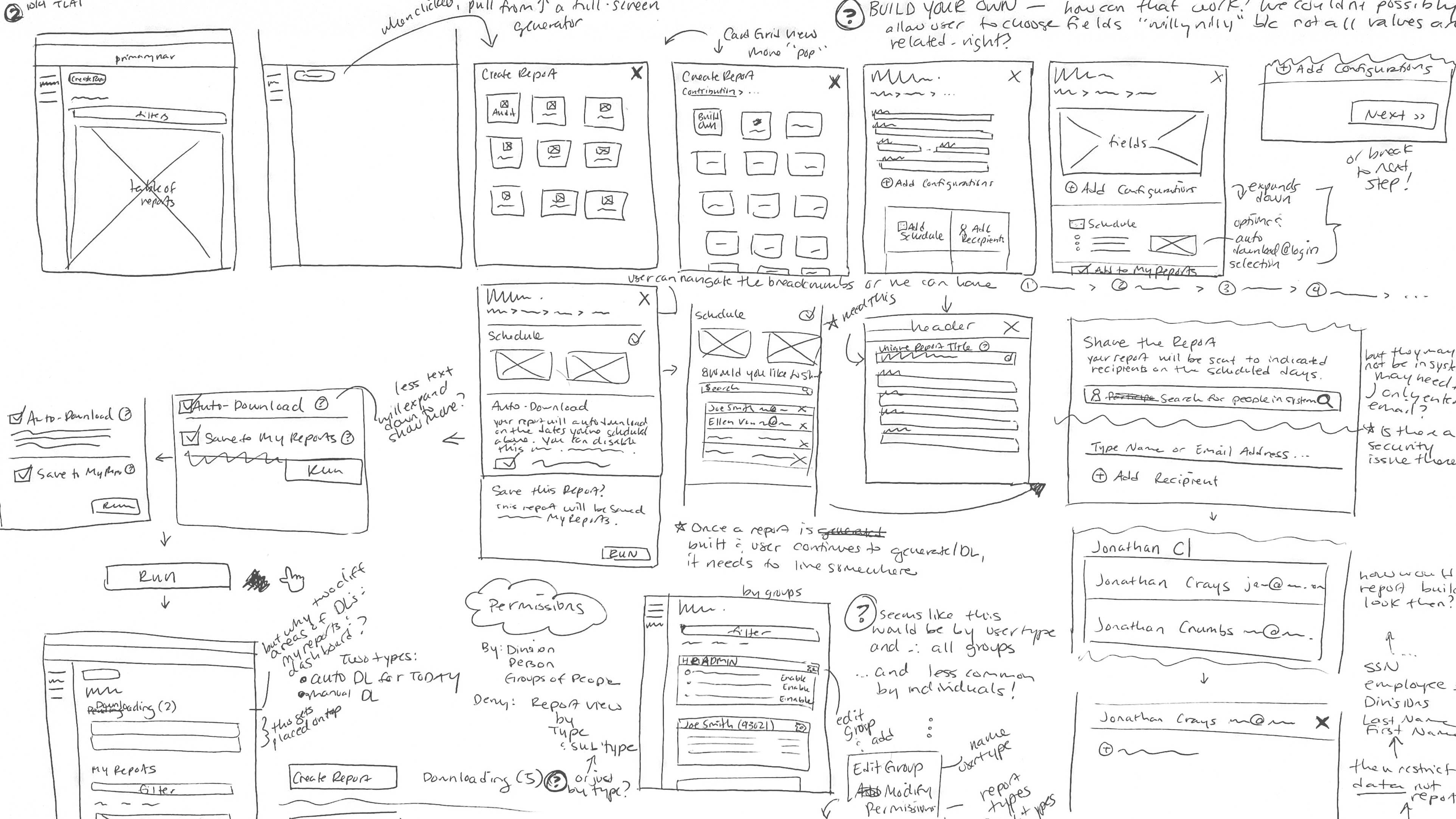
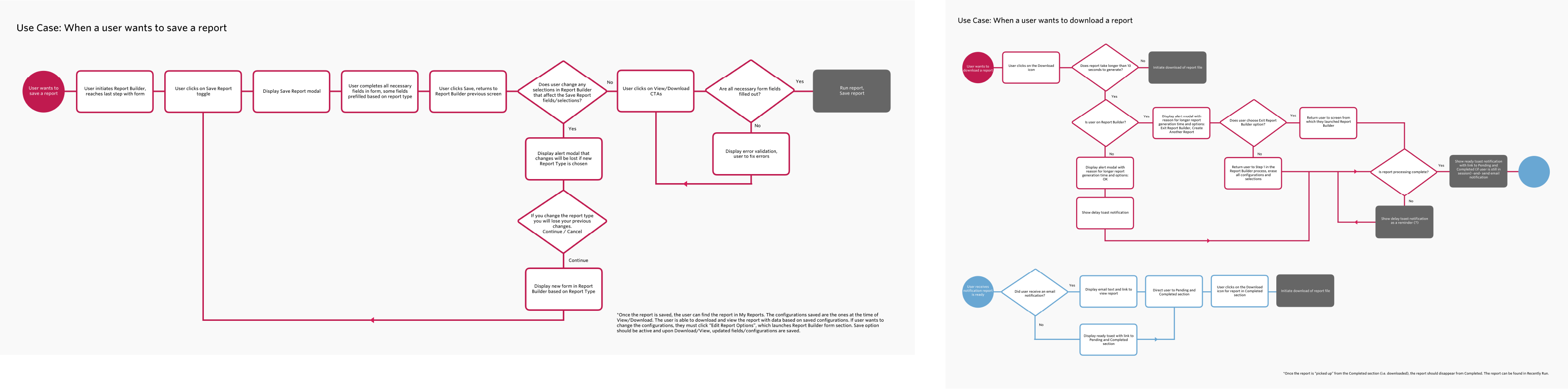
Along with sketching, we conducted use case analyses to understand the logic involved with the most robust features.
We then created designs to address the issues around navigation, clarity, and transparency.
We also explored different solutions for building a report that provided a simplified, guided experience.

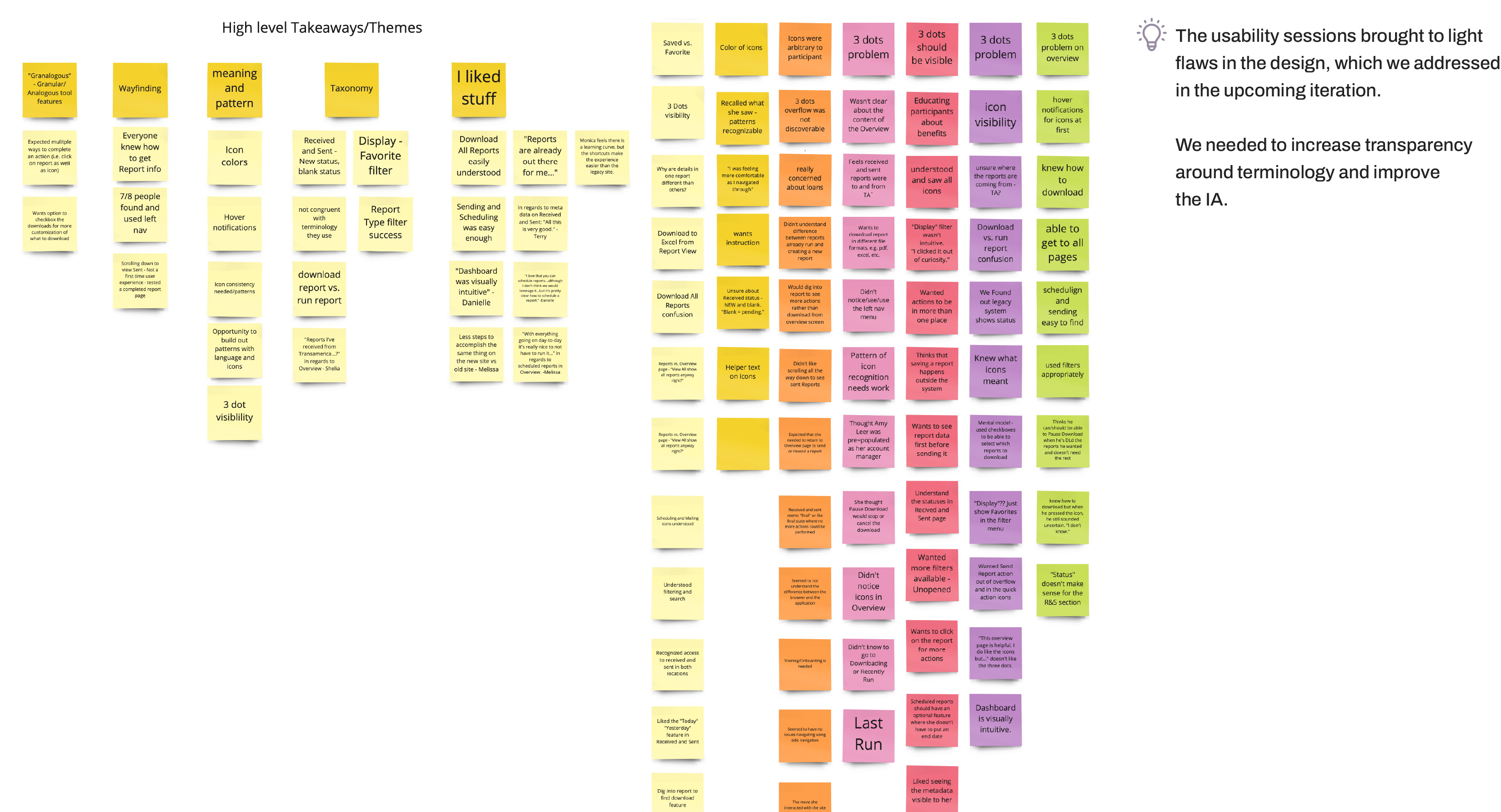
Test & learn
Our team then conducted usability testing on the report center and report creation flow. We created robust, clickable prototypes for the virtual usability sessions.
Design