Dealer Sales Assistant™:
Empowering Sales Teams with a Native Mobile Tool
Overview
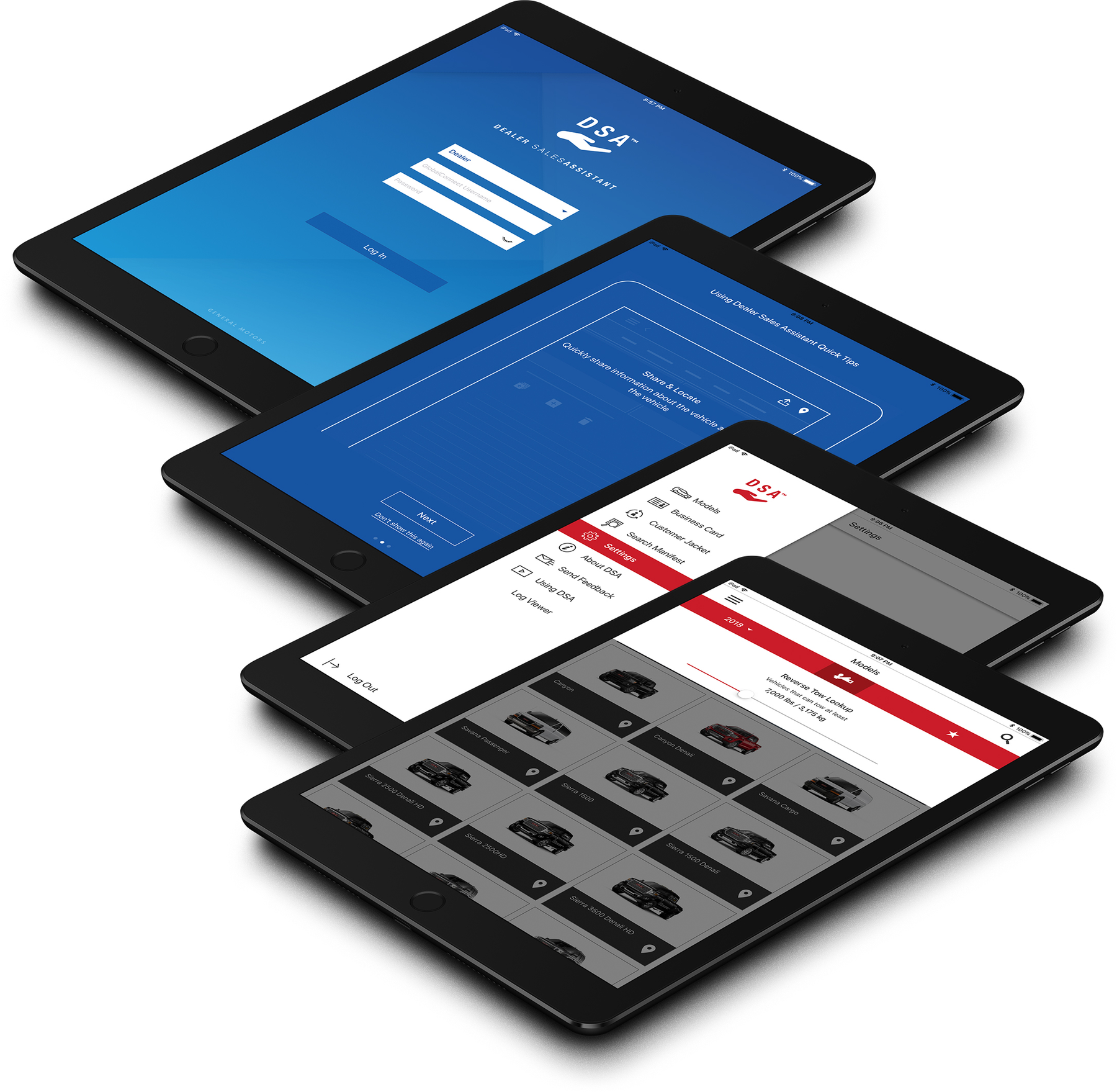
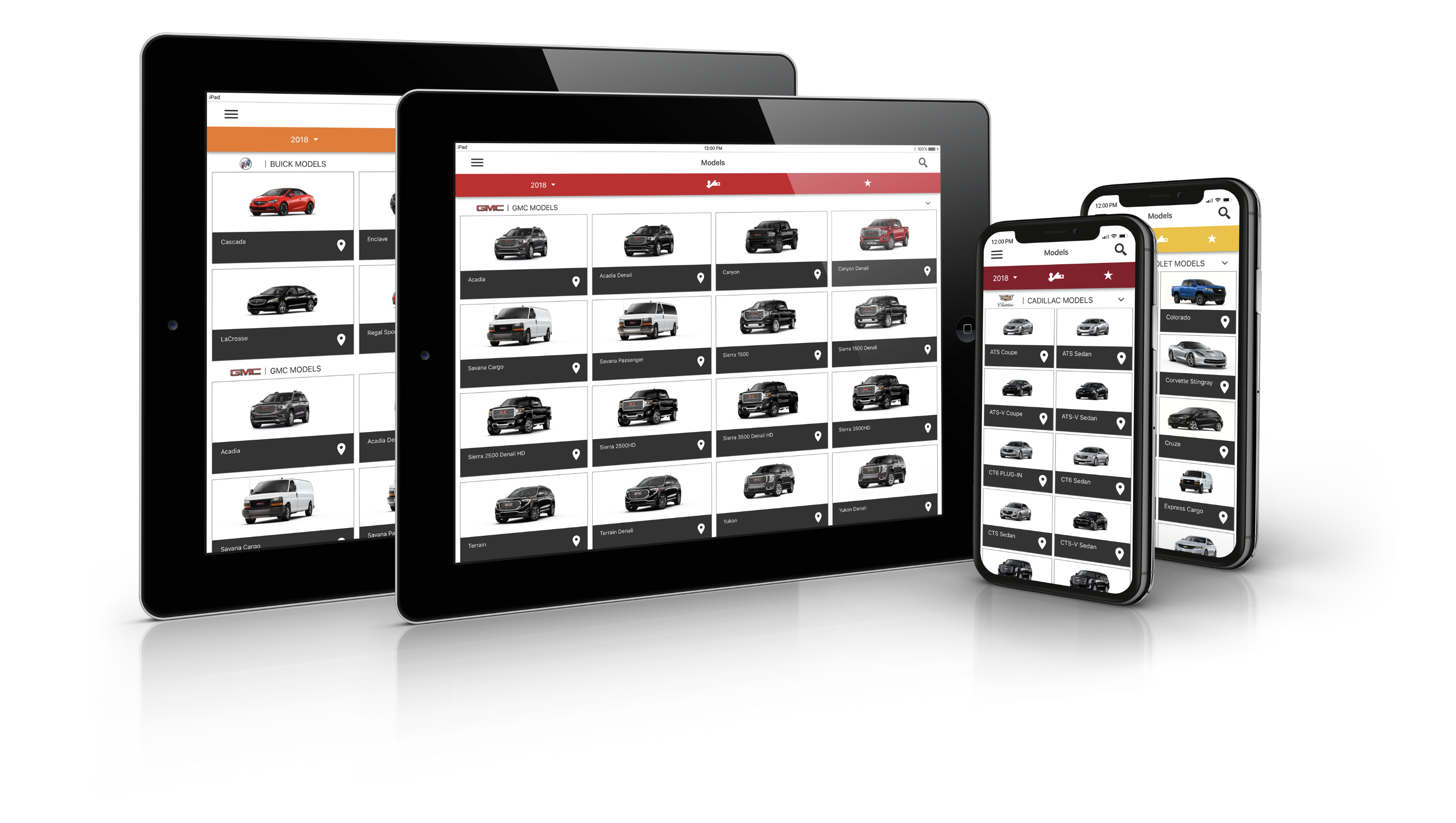
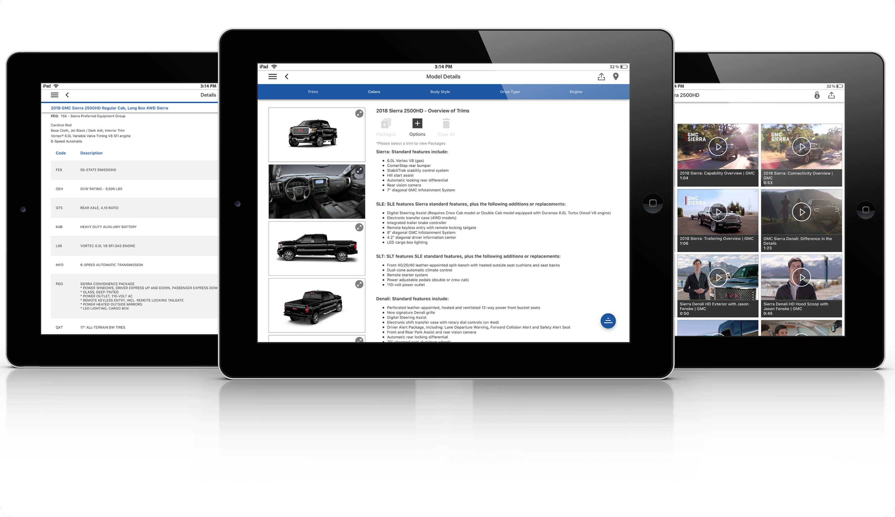
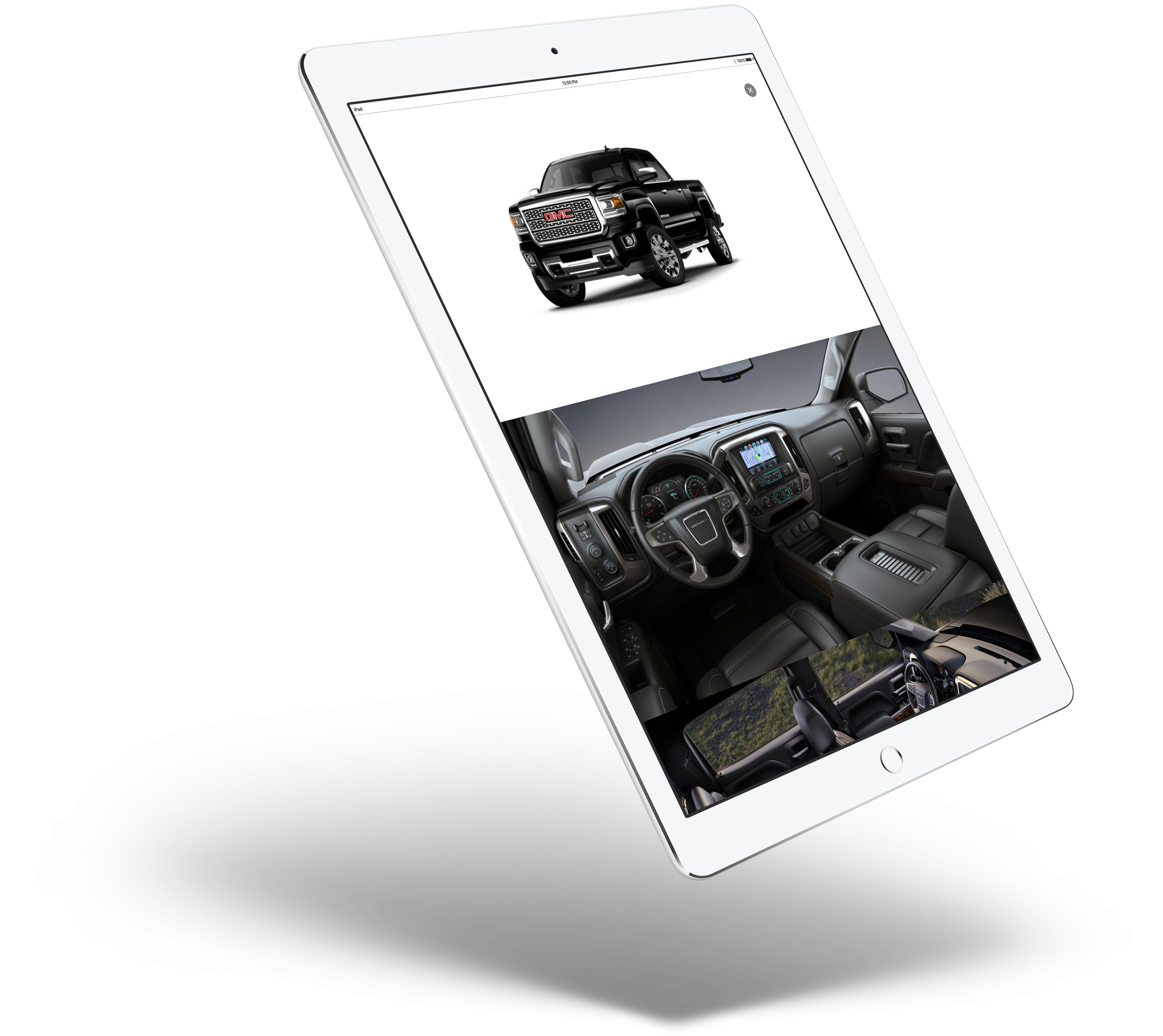
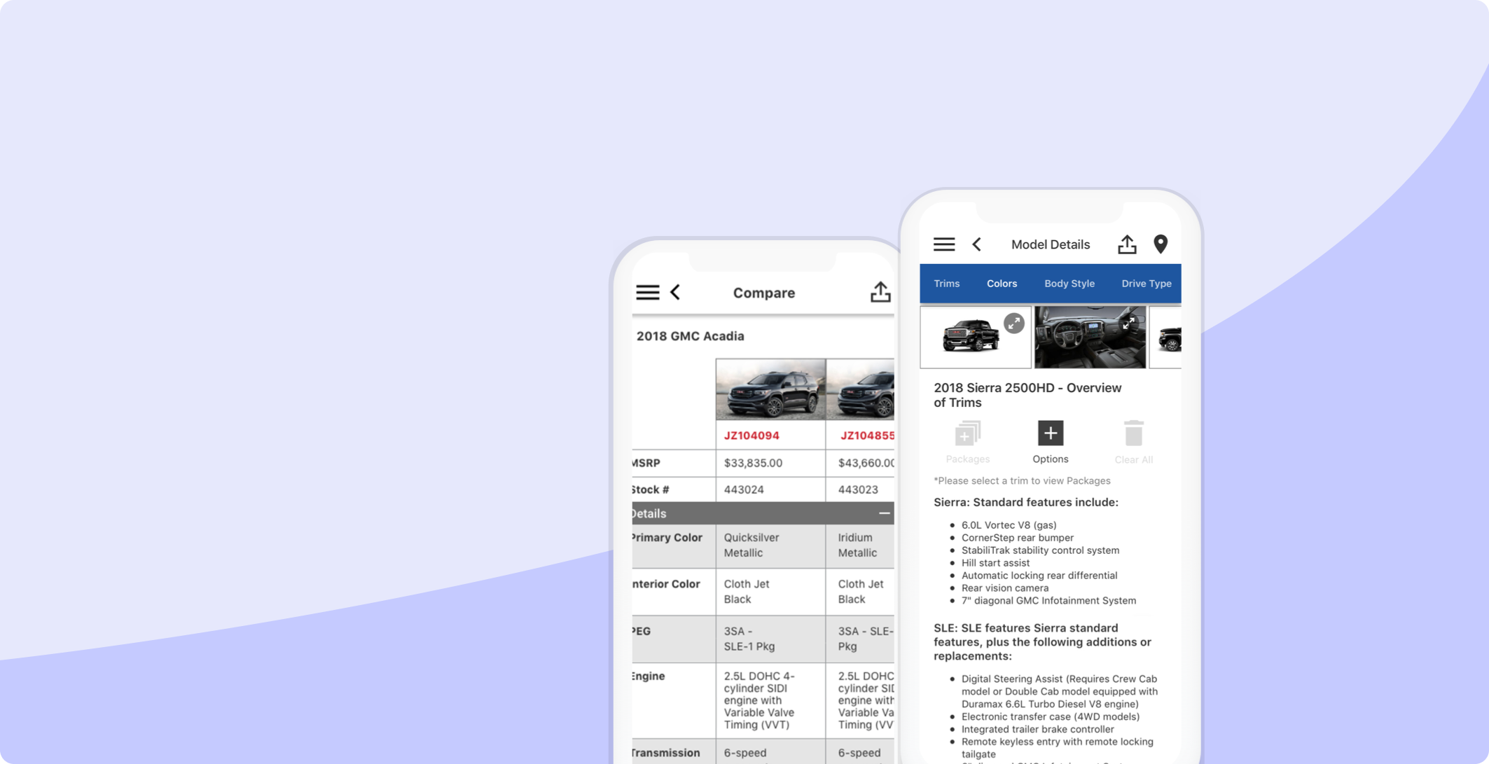
Dealer SalesAssistant™ is the core sales assistant mobile application available for iOS and Android for all GM dealerships and brands. The app provides sales personnel with quick access to important vehicle information to support the sales process.
Problem
The app was first designed for tablet only. There were portability issues and the users wanted it on mobile. We had to rethink the architecture, interaction flow, and visual design. Our design challenge was to bridge the disconnect in the user experience, design, and code base of the legacy product (mobile) with the new product (tablet).
Solution
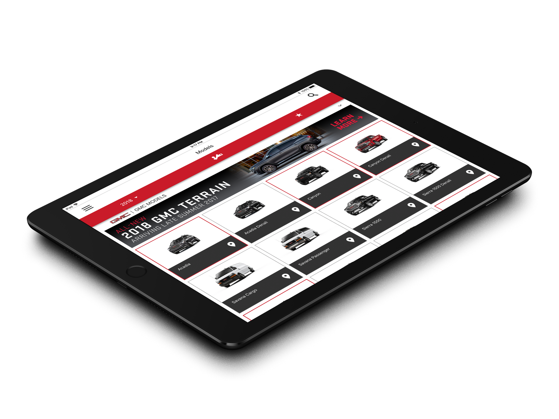
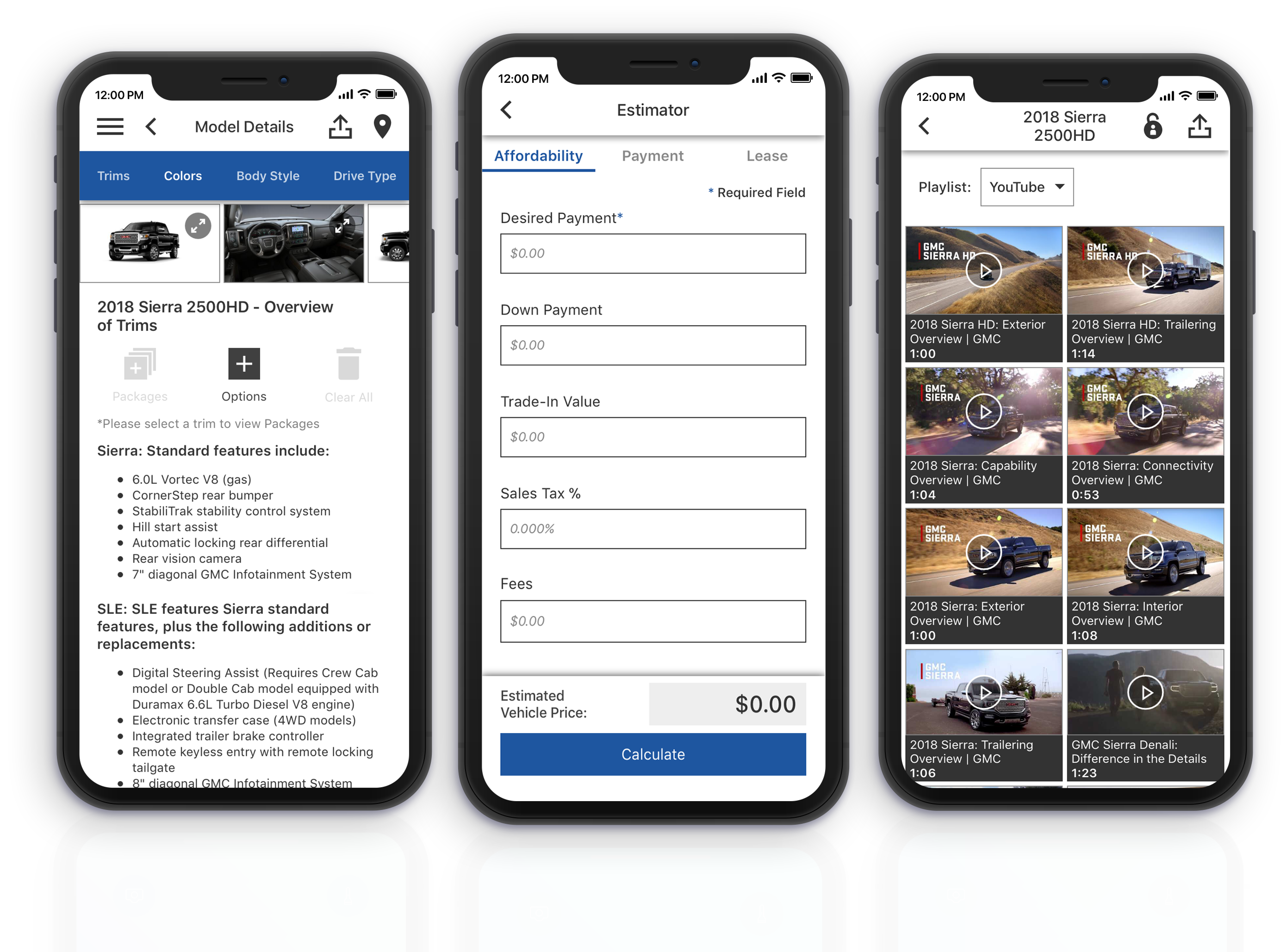
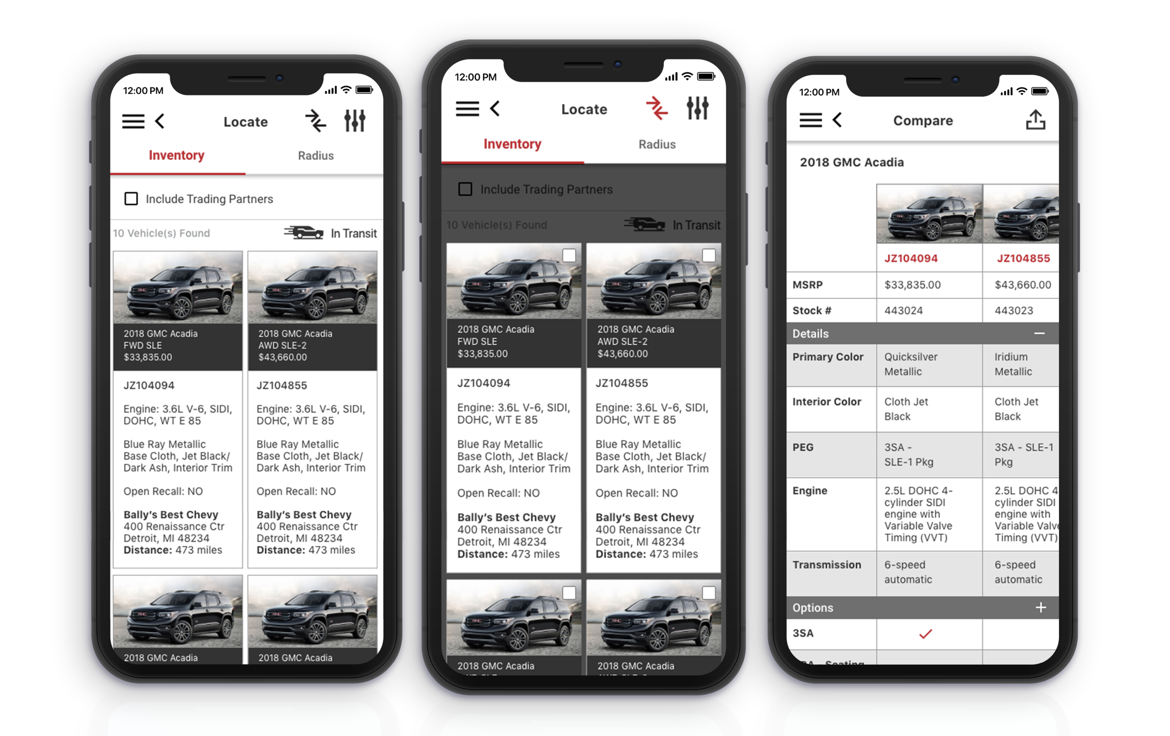
I designed a new, streamlined experience for tablet and mobile devices to simplify complex flows and information-dense screens. I focused on improving feature flows to decrease the steps in important daily tasks, using an image-forward UI to create a better real-time sales-customer experience.
Impact
After almost two years of hard work, Dealer Sales Assistant™ was finally released. I continued to lead the design efforts for this product post release. We improved the app store ratings for both Android (3.5 stars) and iOS (4.5 stars) users.
Role
UX/UI designer
Team
1 PM, 1 Researcher, 6 Engineers
Timeline
2 years
Platforms
Native app, iOS and Android
Process
- Redesign
- New design
The problem, in detail
Dealer SalesAssistant™ is the core sales assistant mobile application available for iOS and Android for all GM dealerships and brands. The app provides sales personnel with quick access to important vehicle information to support the sales process.
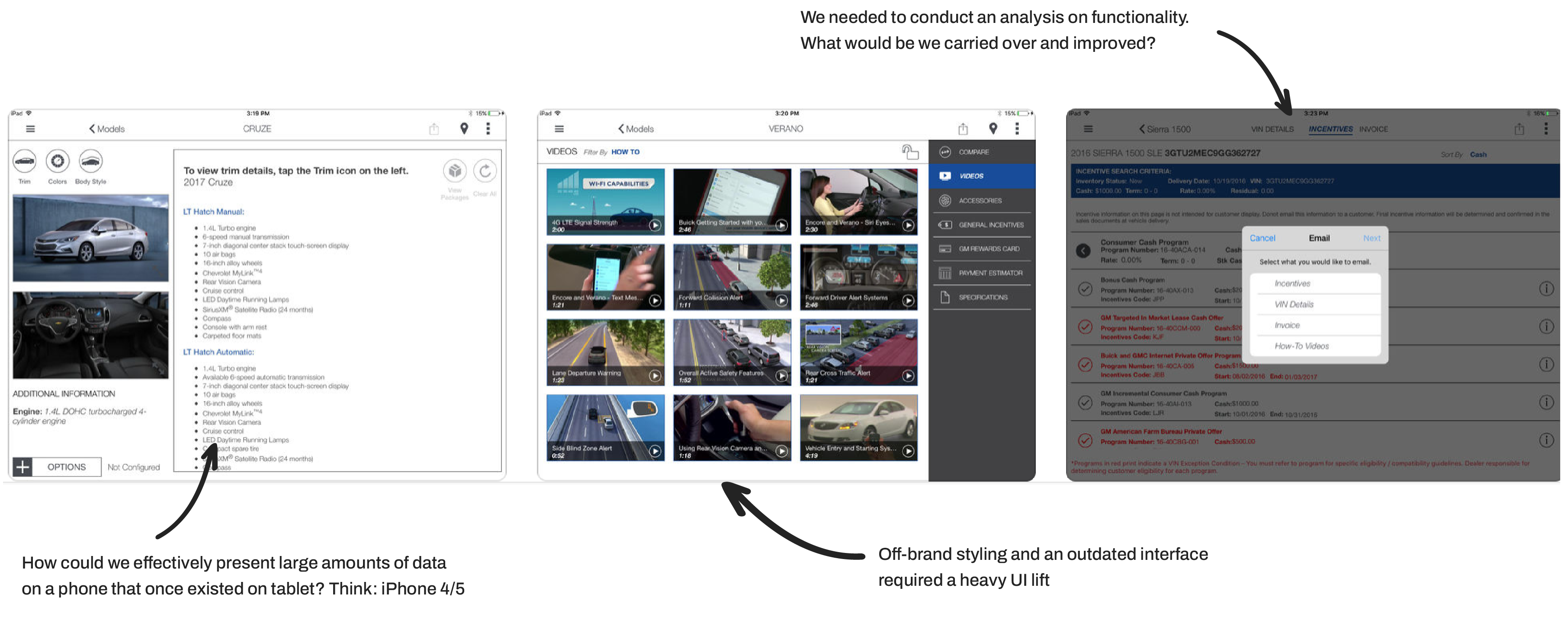
The app was first designed for tablet only. There were portability issues and the users wanted it on mobile. We had to rethink the architecture, interaction flow, and visual design.
Our design challenge was to bridge the disconnect in the user experience, design, and code base of the legacy product (mobile) with the new product (tablet). Ultimately, our team’s and client’s goals for the application was to address all outstanding user experience issues and to create a more flexible, modern user experience.
We asked ourselves:
- How can we effectively present large amounts of data on a phone that once existed on tablet?
- How do we make this transition without disorienting our power users and overwhelming the new users?
Discovery
To kick things off, I dug into all the existing research to build a solid foundation for the redesign. From there, I uncovered pain points and technical limitations by reviewing user feedback, which gave us the direction we needed. I documented existing patterns and sketched early concepts to spark discussions in design workshops.
Discovery & research
Uncover pain points and technical limitations, understand the user
Analysis & documentation
Discuss business goals, KPIs, wants & needs, & release timeline
Design & collaboration
Hands-on collaboration, educate on design principles, & build consensus
Test & learn
Create research goals, conduct in-person sessions, synthesize & refine
Understanding the user
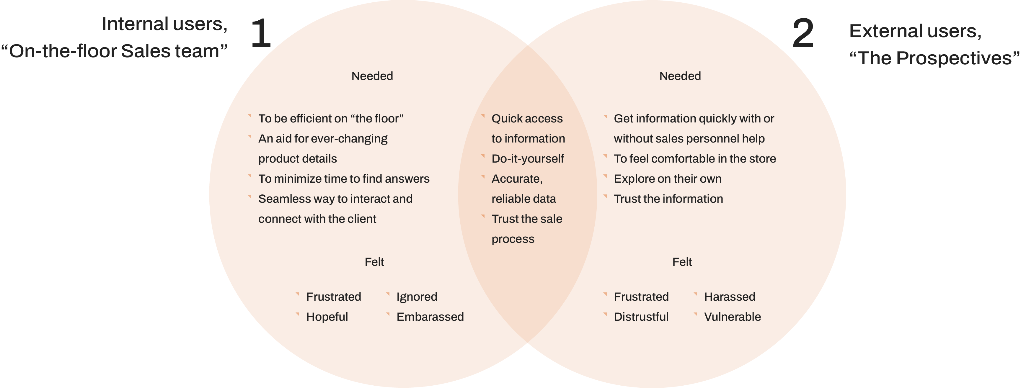
In order to understand how to design the best solution, we needed to understand our users, their needs, and all the user feedback provided to us. We worked with our clients to collect insights.
Design workshops
I began working with the clients to prioritize the features and refine the application's information architecture. Close collaboration with the client in the beginning stages of this project was key as that would set the direction of the project.
I put together workshops for the clients to educate through hands-on design exercises with the actual product content. I used Figma (the old Figma!) to allow for real-time, asynchronous collaboration. This proved successful as the clients began to incorporate more UX design principles into their decision-making process instead of relying on personal preferences.
After a direction was set I was able to start concepting, sketching, and prototyping. I worked closely with the development team in strong feedback cycles, bouncing design feedback and concerns daily.
This was a critical step which would allow me to create requirement or specification/markup documentation that the developers were able to more easily consume. Alongside the close collaboration with the developers, the design team and I regularly held design sessions that frequently included whiteboarding, user scenario, and use case mapping.
Test & learn
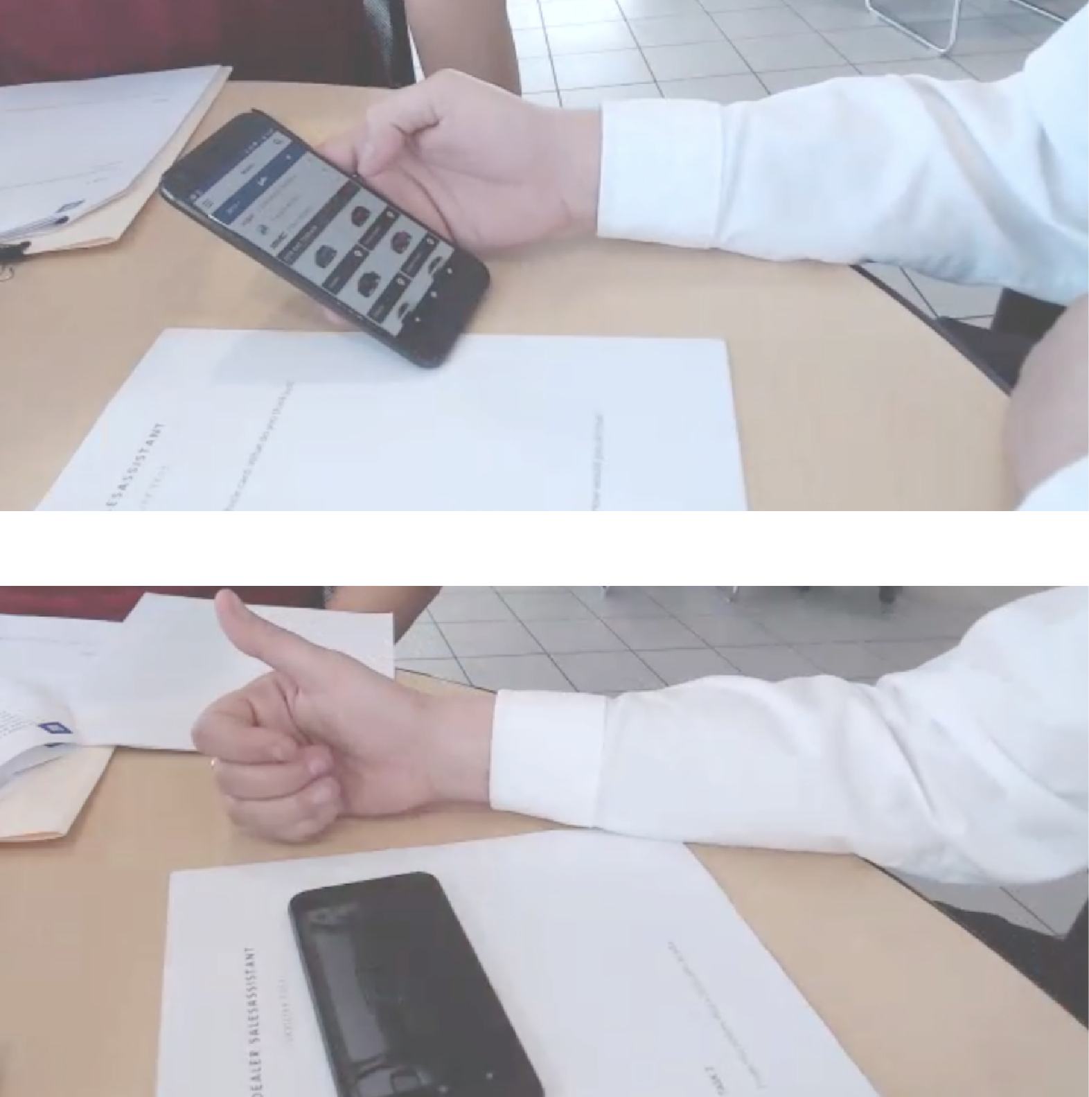
Strapped on time and resources, we strategically prepared the most important areas in the application for testing. A team member and I led the research effort. We scouted for participants and scheduled the sessions. We crafted the script and conducted synthesis.
We tested at three locations. We had a full session with 16 tasks. Our goal was to uncover the biggest UX issues and to validate the overall IA. Ultimately, the average success rate for the features tested was 60%.
Our synthesis of the results showed us that users were struggling in key areas and in areas we thought would be more intuitive. Our strategy was to address the most severe usability issues such as:
- Findability
- Recall
- Feature flows

Designs
After almost two years of hard work, Dealer Sales Assistant™ was finally released. I continued to lead the design efforts for this product post release. We improved the app store ratings for both Android (3.5 stars) and iOS (4.5 stars) users.
