Transforming the Owner Journey with a Seamless Owner Account Experience
Overview
Evolve is a vacation rental management company focused on delivering 5‑star guest experiences and management services for vacation rental owners. Most of Evolve’s owner users fall within the 45–64 age range and are distributed across the US.
Problem
The Owner Account (OA) was outdated, fragmented, and difficult to use. Over 30k owners relied on it weekly, if not daily. Built on Salesforce Communities, which meant it was hard to scale and customize, and the legacy experience broke accessibility standards, used clunky flows that often led to dead ends, and forced owners to call support for basic tasks. This eroded trust and created major inefficiencies. Compared to competitors like Airbnb and Vrbo, Evolve’s OA felt opaque, so to speak, leaving owners disempowered. To move forward, we needed a modern platform, a stronger research foundation, and a scalable design that rebuilt trust and put owners back in control. This was originally a 1:1 feature parity project.
Solution
I partnered with another designer to redesign the Owner Account (OA) on a modern platform with a new design system, refreshed branding, and improved information architecture. I unified web and mobile, prioritized self-serve features, and removed frustrating dead ends. We rolled out iteratively—starting with mobile, where ~56% of users were active—while keeping the legacy platform live to ease adoption. I conducted continuous usability testing with our researcher to ground decisions in data, partnered with content marketing on new Owner Accountguidelines, and designed micro-interactions that made the experience feel polished.
Impact
The redesign significantly boosted satisfaction and usability. Nearly 90% of owners rated the new experience as extremely user-friendly, often calling out the cleaner layout and streamlined navigation as major improvements over legacy. Repeat bug reports dropped by ~30% and support calls for legacy issues declined as well.
Role
1 of 2 designers
Team
2 PMs, 1 Researcher, 5 Engineers
Timeline
Nov 2022 - Dec 2024 reached 1:1 parity
Platforms & integrations
Native app, responsive web. Salesforce, React.
Process
- Full redesign UI, UX, and IA
- User persona creation, usability and user research
- Flow analysis, internal process audits, competitive analyses
- Product strategy
The problem, in detail
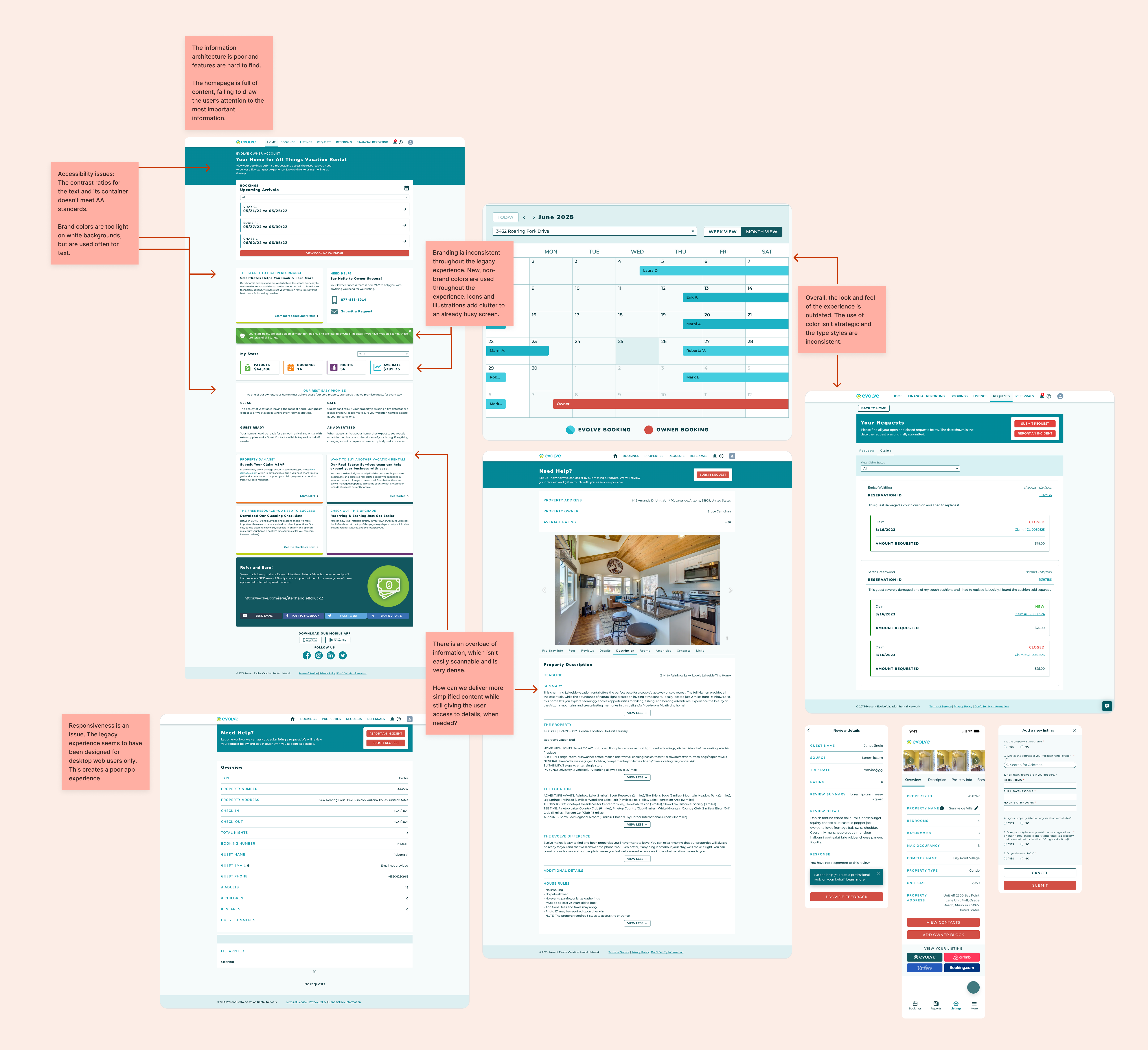
When I started this project, the legacy Owner Account (OA) was a mystery box. Opening it was like opening Pandora’s box. Built years earlier on the Salesforce Communities platform, it had little documentation and was a patchwork of flows that didn’t always connect.
Owner NPS was declining as users grew frustrated with an experience that no longer met their needs. Compared to competitors like Airbnb and Vrbo, the platform lacked the self-serve tools and transparency owners expected. Too often, they hit dead ends that pushed them to call or email for support, leaving them feeling dependent on Evolve rather than empowered as partners in their own vacation rental journey.
Digging into the problem revealed how heavily technical debt held us back—small fixes were slow, messy, and often invisible to users. The result was an outdated product that fell short of modern standards, leaving owners wanting a self-serve, mobile-first, and transparent experience. To move forward, we needed a redesigned experience that delivered the familiar functionality they expected.
30k+
owners on the OA platform
56% vs 44%
app vs web users
owner sentiment
Users felt OA was hard to navigate, clunky, and time-consuming. They also felt dashboard had tons of information everywhere, a lot going on, and it feels like an advertisement board.
Reviewing the legacy OA experience
Discovery
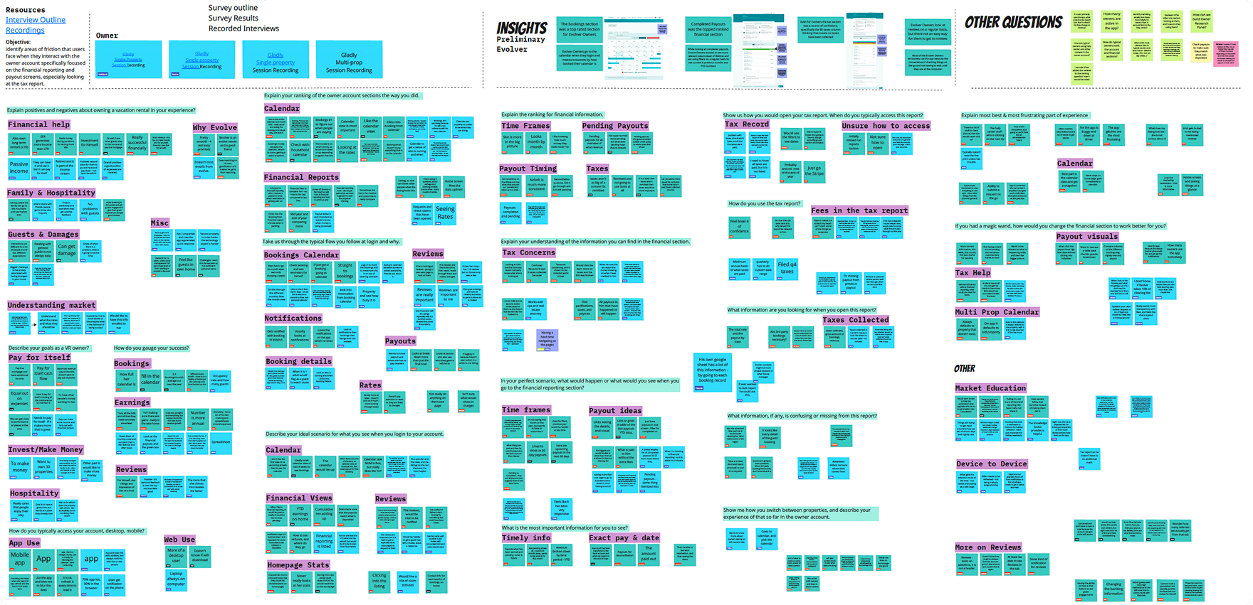
To understand what problems we needed to solve, I partnered with our researcher on a qualitative and quantitative deep dive.
- Defined key personas: First-time Renters, FRBOs, Investors, and Hands-on Hosts—making sure my designs reflected our diverse user needs.
- Dug into for user insight: I collaborated with our researcher to conduct interviews and surveys to understand what was working and what wasn’t.
- Analyzed the UX and UI: I uncovered pain points like confusing flows, accessibility issues, and lack of responsiveness.
- Dove into our data on Salesforce: I wanted to better understand what our technical contraints were in order to make important improvements for mvp.
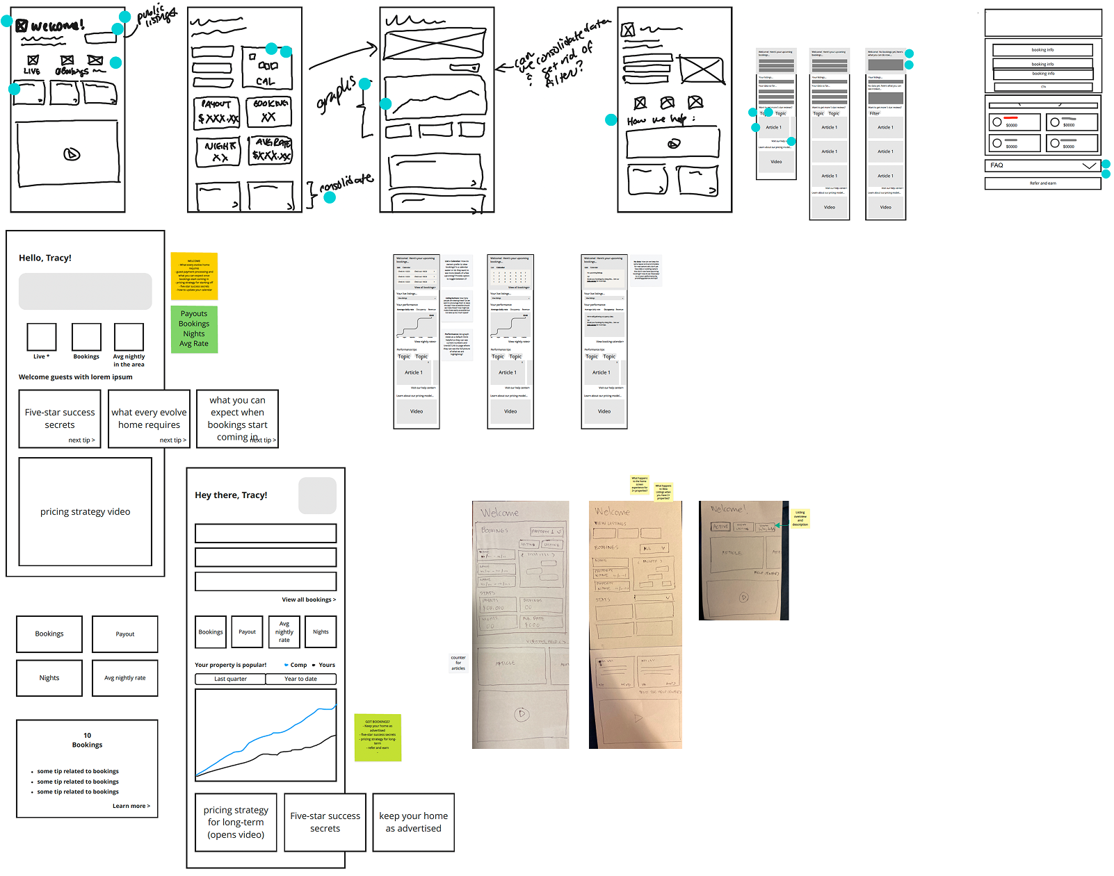
- Wireframes: I created quick wires to guide the team in strategy discussions.
By time-boxing research to 1–2 weeks per phase, I kept momentum and stayed lean while grounding my design decisions in data.
Timeline
Varied; we time boxed research to 1-2 weeks, including synthesis
Participants
Owners in our research panel, In-house owners
Total features analyzed
19+ features on both web and app
Tools
UserTesting, Chattermill, NPS surveys, Zoom
Used personas to guide every feature redesign from UI to IA

First-time renters
As first-time hosts, users are overwhelmed by the complexities of vacation rentals. They need an experience that provides a lot of tips and education so they feel supported and can succeed.

FRBO / For rent by owner
Experienced owners who value control and efficiency. They want powerful tools that streamline management without sacrificing autonomy.

Investor
Investors focus on profitability and insights. They need clear data and downloadable reports to optimize performance.

Hands-on host
Hosts who value personal connection and memorable guest experiences. They need quick access to the most important daily tasks, with robust guest data over time.
A compilation of extensive user research on OA pain points
A snippet: starting to wireframe different features. My co-designer and I dot voted for designs we wanted to continue exploring.
Solution
Our ultimate goal with the redesign was 1:1 feature parity, but I also saw it as a chance to make meaningful UX improvements without ballooning scope or timelines. It meant I had to stay lean and creative.
Looking back, delivering a full web and app redesign felt like orchestrating a smorgasbord of methods, workflows, and responsibilities. I defined the solutions by:
- Redefining the foundation: I audited the legacy IA, combined findings with research insights, and redesigned navigation across app and web to better support user goals.
- Mapping end-to-end journeys: This helped me identify expectations we weren’t meeting and pinpoint where creative design could make the biggest impact within our constraints. I also documented the communication received at each phase in the user's journey.
- Iterating designs with cross-functional input: For every feature, I started with quick wires, reviewed feasibility with engineering, tested with users, and refined into final designs.
Rollout plan
- Since mobile app usage was higher (users loved push notifications) we started with the new app experience first, followed shortly by web. I partnered with the PMs to prioritize the feature release order, using both feature usage stats and importance based on task analysis.
Mapping out the end-to-end journey and identifying gaps in the experience

A snapshot into the information architecture: for new web

Designs
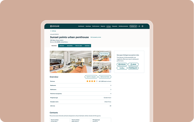
To reach parity, we redesigned 19+ features across web and app. All web designs were responsive for desktop, tablet, and mobile breakpoints. Here's a sample of screens (some screens shown here were designed in collaboration with my co-designer):


What impact did we have?
The release of the new web and app experience happened iteratively and was met with positivity from our users. ~95% of our users said the new experience was very user-friendly and that the new look was pleasing 🎉
Launching the new Owner Account experience on the new platform was a huge feat. This allowed our entire product team to move faster with any net new features.
Opportunities I noted
- Due to some legacy backend constraints, we weren’t able to make some large changes to the experience as we wanted. Users still noted these issues in the new experience, so we made sure to keep track of the new feedback to help shape our future roadmap.
- Meeting parity with the legacy experience did mean we carried forward some sub-optimal UI patterns. For the features I owned, I intentionally kept some of the UI “familiar” in the initial launch to reduce cognitive load, knowing our users were less tech-savvy and struggled with change.